La Luce Libre
May 26, 2026
Alex KiersteinThe Ferrari brand is strong enough to allow it to occasionally upset the cognoscenti with a weird experiment. The Luce may test that bond.
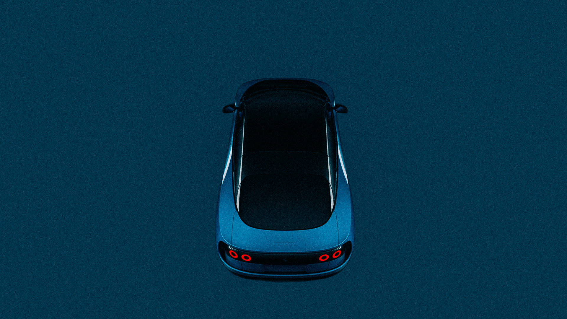
I had an inkling that the Ferrari Luce was going to be more controversial than your average new release from Maranello the moment those Jony Ive interior bits were released as part of a Luce tease. I did not imagine that the exterior design would diverge so far from the contemporary norm. So reading through what I wrote then, open to the notion of a user-centric philosophy, nodding approval of attention paid to ergonomics and legibility—all things generally an afterthought in Maranello—I see myself expecting continuity. Think: Purosangue with a neo-retro twist, like the F80’s square shoulder pad fender flares and Daytona-esque nose.
Boy, was I wrong. Although if you want to imagine an F80’s nose treatment on an electric SUV, check out the Zeekr 7GT. Then ask yourself if the Luce looks better or worse. Remember, aesthetics are subjective.
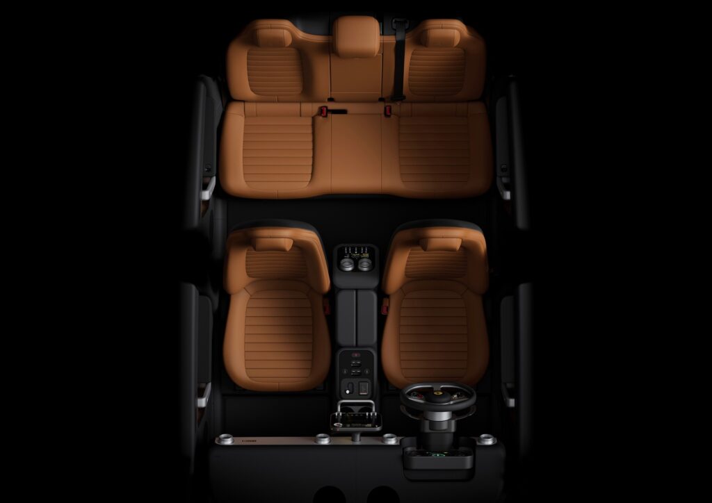
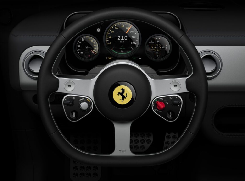
I still appreciate that attention paid to the interior design, the clarity, the simplicity. Setting aside the very Apple-ness of it, that is—I don’t mind it, but it seems in aesthetic discord to the brand. Ferrari is high-tech, but Maranello isn’t Silicon Valley. But a highly usable interior isn’t worth much if the exterior doesn’t do its job.
That job is to show other people that you own a Ferrari. Even the edge-case Ferraris, the Mondial and the 400, are clearly Ferraris. I think everybody is now in agreement that the Dinos are Ferraris. Drive any of these, and you drive a Ferrari.
Tape up the badges and give the taillights a little red cellophane camo treatment, and what is the Luce? It’s soft, rounded. Even the Purosangue’s core form, which is organic, is bisected by creases, cut lines, and convex relief. The Luce relies on the contrast between the main paint color and contrasting black accents to do what the Purosangue does with three-dimensional design elements.
I wouldn’t argue that the Purosangue is all that elemental a distillation of Ferrari’s design language, but it is inarguably a Ferrari. It looks like a Ferrari, whether you like that or not. And most Ferraris are visually complex, anyhow. The 849 Testarossa has a lot going on, the F80 has more. The simplest and most classic Ferrari, the Amalfi, looks like it’s ready to kick your ass. All of them look fast, which they are, but their aesthetics are derived from that focus.
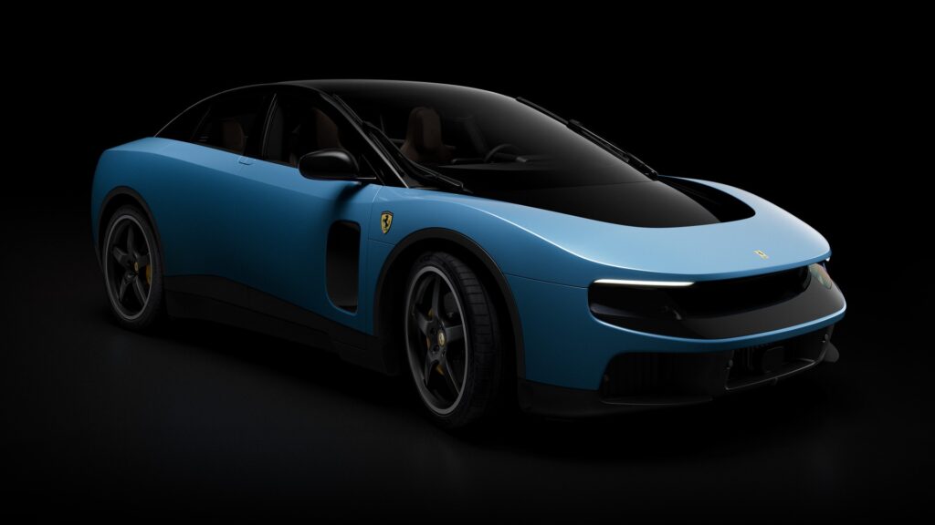
The Luce is something very different. To my mind, this is a shape which is perhaps not unattractive, but born from a process by which “looking fast” wasn’t Job One. Ferrari’s press release makes a point of differentiating Maranello’s internal Style Centre design studio from the Jony Ive/Marc Newson collective LoveFrom, which did the design work.
Farming out the first EV is a strange tack for a brand that brought styling under its own roof under Flavio Manzoni. I’m cynical, so perhaps it’s plausible deniability, an air gap. But this is a strange Ferrari; beyond the electric drivetrain, it’s the brand’s first five-seater.
The overall weirdness of Ferrari sales—maybe allocations is a better word—mean that I don’t know if units moved will be any indication of the success of the Luce. It may broaden the brand’s appeal somewhat, to less traditional Ferrari buyers, but the $640,000 starting price puts a very hard limit on exactly how much.
I have trouble accepting this as a Ferrari, although I personally don’t mind the exterior styling from most angles in a brand-agnostic sense, and I’m very much a fan of the misfit Ferraris. Judging by the discourse among my peers, I have a gentler reaction than most.
But you don’t have to rely only on my gut feelings about the Luce to help anchor your take on it. The market’s response is unambiguous; Ferrari is down almost 5% in US trading, more internationally. Investors were expecting something different, and cumulatively their response echoes that of the professional reviewers and critics (like my colleagues, and me).
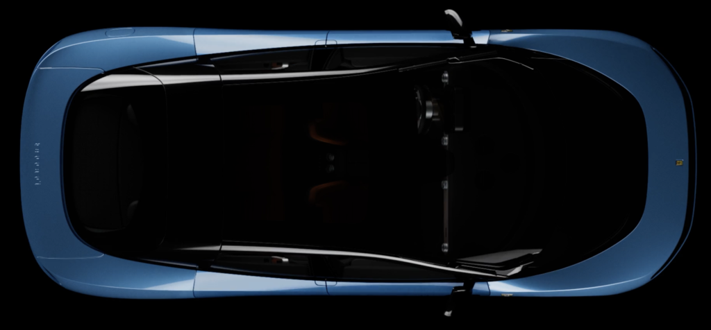
I want to mention that while some are going to indict LoveFrom for the soap-bar design of the Luce generally, I think it’s worth differentiating between the design on its own and the design’s merit as a Ferrari. Newson’s last notable automotive design, the adorable Ford 021C, is firmly rooted in the Y2K era it was born in, but works today. Timeless. Ford could revive it tomorrow as a cute global EV runabout and I think we’d all go nuts for it.
The Luce isn’t, and maybe couldn’t be, so instantly charismatic—and certainly not as branded—but with a few minor tweaks, it might be an interesting Fiat or Lancia. It’s the vast gulf between our collective expectations of what a Ferrari should express aesthetically, and what the Luce delivers, that are jarring.
I can say that the Ferrari Luce represents a bold move; it’s audacious to attempt something so far afield from the safe and familiar Ferrari aggression. Bold, but maybe not savvy.
One response to “La Luce Libre”
-
“looking fast wasn’t Job One.”
From my seat, this is the miss. They had a chance to make something special and this is what they came up with. Oops

Recent Posts
All Posts
May 27, 2026
May 22, 2026
Leave a Reply
You must be logged in to post a comment.