Verhoeven Vision
December 17, 2025
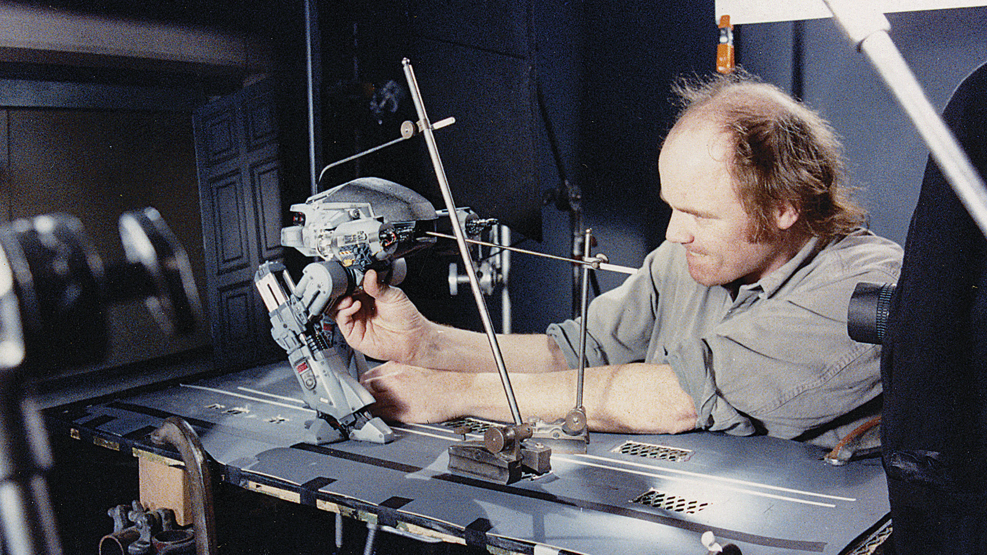
Jay RameyLiving in a Paul Verhoeven timeline is bad enough, but is there a Verhoeven aesthetic that's separate from '80s retro-futurism?
Recent Posts
All Posts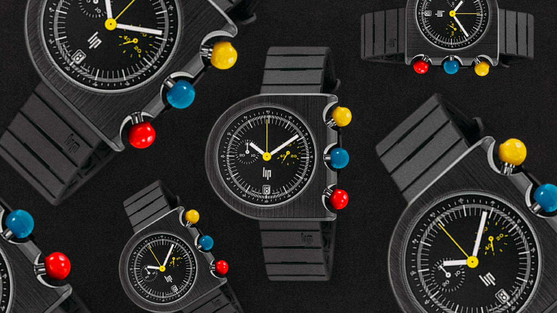
The LIP Mach 2000, a convention-defying watch in its day, is an affordable modern classic now.
Alex Kierstein
June 16, 2026
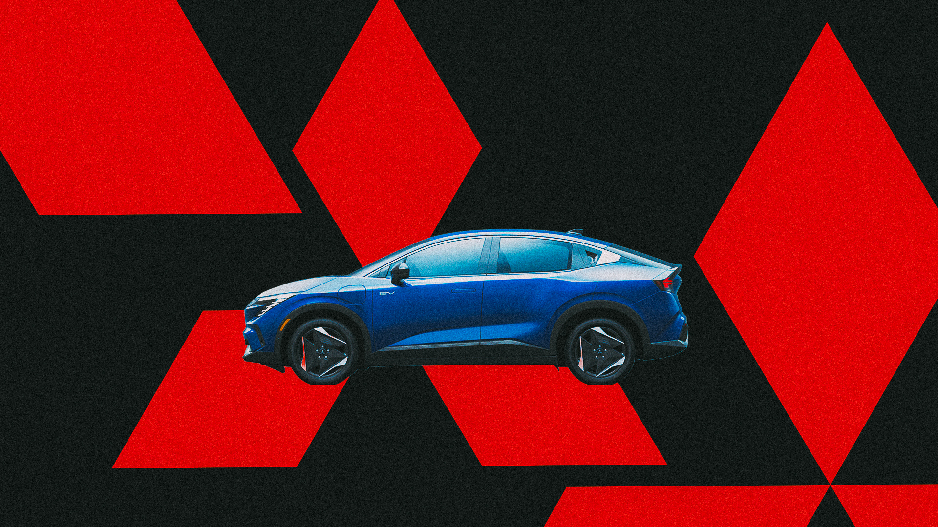
Two automakers facing challenges exchange technology and models. What’s the problem, other than the name?
Alex Kierstein
June 16, 2026
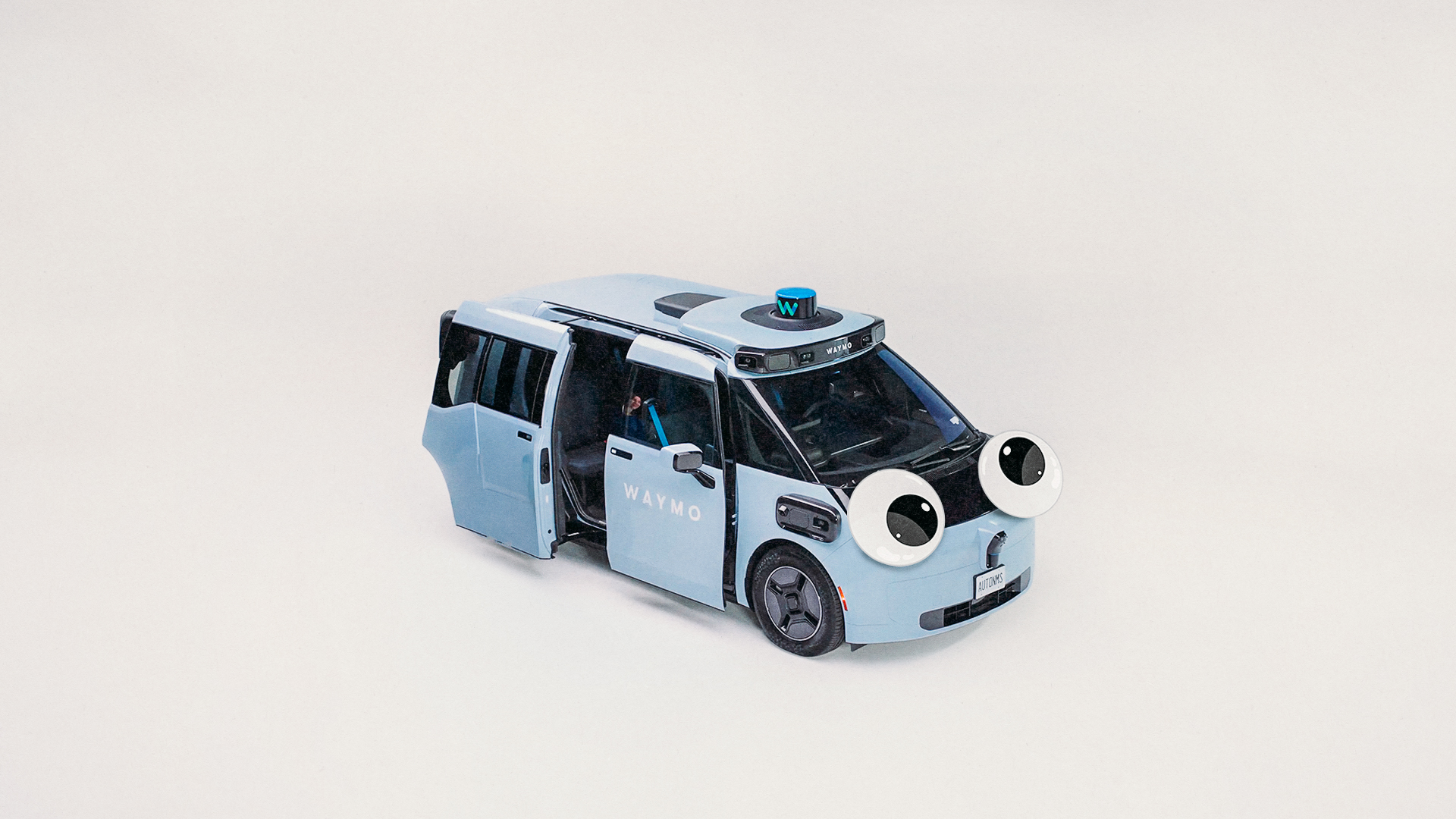
What do you call a driverless car that stops and won’t move? A big problem.
Alex Kierstein
June 11, 2026