The Diagram
February 18, 2026
Alex KiersteinThe von Kármán–Gabrielli diagram is a fascinating way to illustrate the cost, however that is defined, of moving around.
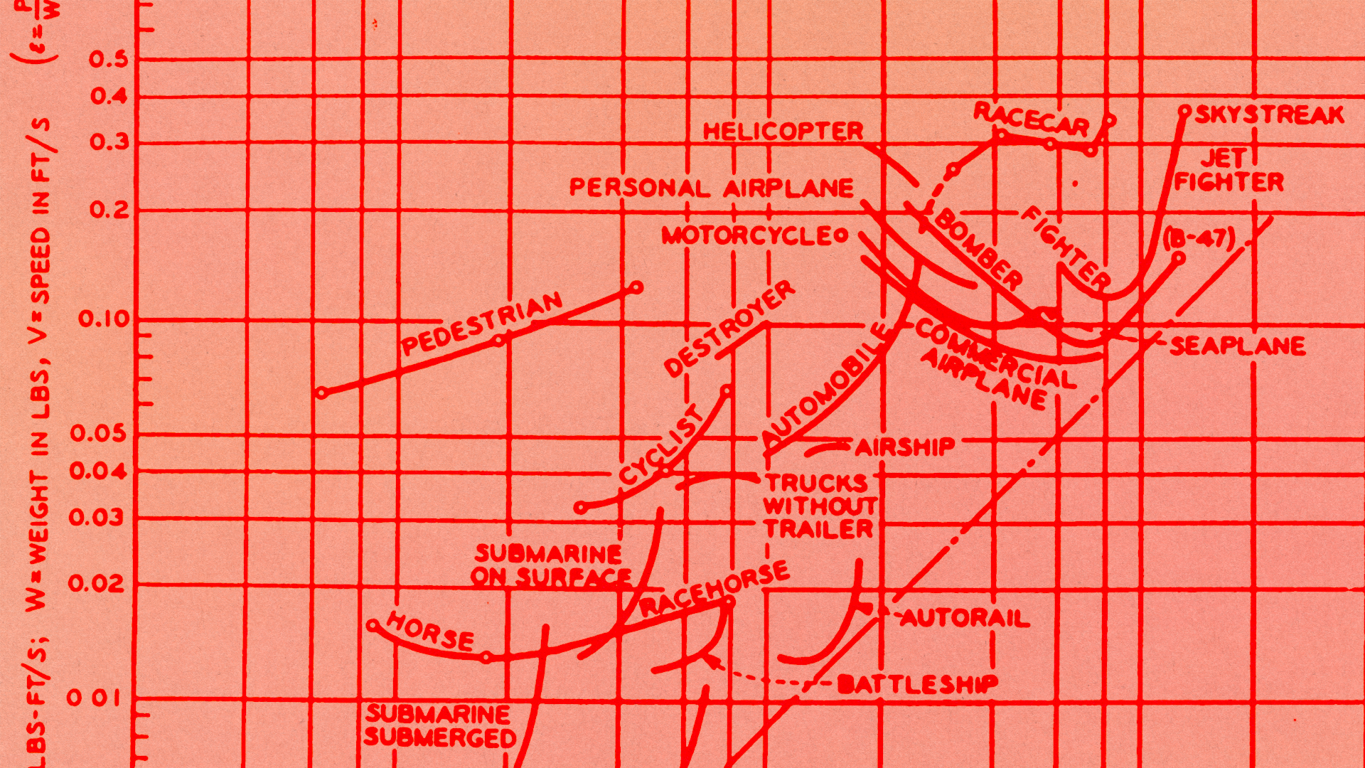
I knew about the Kármán line, the generally accepted altitude at which one has reached space. I did not know about the von Kármán–Gabrielli diagram, which is a fascinating way of showing the relative efficiency of a broad variety of vehicles. It’s a tool for comparative analysis—what’s the best vehicle for achieving a particular outcome? And given von Kármán’s expertise in aerodynamic forces, the central theme is balancing the speed of travel with the associated aerodynamic drag. In other words, slower is better, as increased speed equals increased drag, requiring more energy. Or, in von Kármán’s and Gabrielli’s own words, in the title of the paper introducing the diagram, “what price speed?”
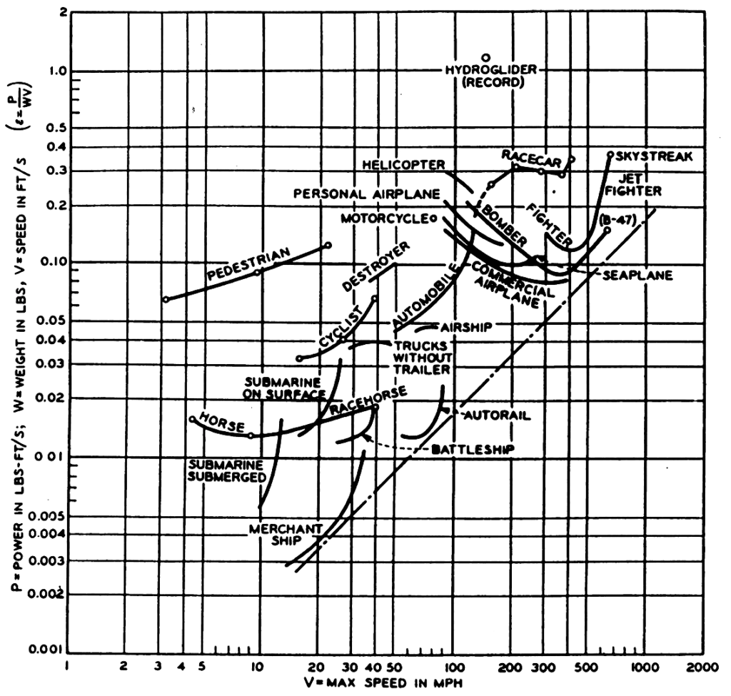
Now, I’m not an engineer, so the actual mathematics and physics underpinnings of the diagram are lost on me. But the basic concept, and the way it is visualized, is accessible to non-engineers. And transportation planners, for whom the diagram is a nice way of organizing their thinking when determining the best method of getting goods or people from one place to another in the most economical way. (Also, military planners.)
It’s also inspired vehicle designers and engineers to explore the extremes of the diagram. Faster is generally less efficient because of the realities of fluid dynamics, but there is also a monetary value to time (as in, lost efficiency costs). So any breakthroughs in high-speed aerodynamics, like more efficient supersonic airframes or engines, alter the diagram slightly.
The Hyperloop concept comes up a lot in the materials I’ve found analyzing the boundaries and opportunity areas in the von Kármán-Gabrielli diagram. It’s almost the perfect diagram outlier, in that it tries to nullify so many of the constraints that the diagram balances. Air resistance? Pump out most of the air so there’s less of it. Frictional losses? Maglev tech; no bearings or wheels to sap energy.
Here’s where the brilliance of the von Kármán-Gabrielli diagram comes in. When you plug in some of the realities of the hyperloop idea—costs, particularly in terms of infrastructure, capacity—the groundbreaking aspects of a low-pressure, high-speed, low-drag train break down. A conventional high-speed train may not be as efficient in terms of energy/speed, but on balance its higher capacity and lower (relatively) infrastructure costs might balance it out. Plug some good data into the diagram and let it show you the trade-offs.
I think this would be a fascinating way to visualize the specific efficiency of cars on sale today. It makes sense than an enormous, heavy EV like a GMC Hummer isn’t all that efficient in an absolute sense. You could bike to your destination for a fraction of the absolute energy required to move a GMC Hummer a few feet. But imagine plugging in all of the factors: recharging time, carrying capacity, manufacturing costs, total lifetime emissions. Plotting it all out. Determining the diagram’s variables and seeing what comes out on top. The outcome would depend, of course, on the quality of the data and which variables are selected. But I can imagine that it’d be a super interesting and useful tool to help make vehicle purchase decisions.
Maybe someone with math skills—not me! That’s why I write!—could figure this all out. Make an app or website visualizer. Let folks play around with the variables, generate different diagrams illustrating the specific efficiencies of their preferred vehicles. I would happily do some QA testing.
Recent Posts
All Posts
February 20, 2026
February 19, 2026
February 18, 2026
Leave a Reply